Staying on brand means being true to your brand’s identity. It’s consistency in your marketing across channels, consistency in your products and practices, and, most importantly, it’s that consistency that dictates how your customers feel about your brand.
We hear it all the time…” I don’t want to use pop-ups; discounts aren’t on brand for me.”
Brand leaders who say this often perceive pop-ups as annoying or tacky at first glance. They’ve heard the party line that pop-ups aren’t something a high-end website would use and think putting them on their site would cheapen their brand.
But what if I told you…pop-ups don’t automatically equal discounts? Here at Justuno, our philosophy is that your onsite messaging has only one mandate: to provide the best possible website experience for your visitors.
So, let’s think beyond the stereotypical discount in exchange for an email address pop-up you’re picturing and consider how a little outside-the-box thinking can lead to an enhanced website experience.
Below are fourteen strategies to help drive website conversions (both sales and opt-ins) that not only don’t involve a discount but sometimes don’t even include a “pop-up” at all. Leverage these to stay on brand and provide a next-level customer experience that drives increased conversions.
Non-Discount Incentive Suggestions
1. Free Samples
This is not a groundbreaking strategy; so many brands do this. It’s a great way to get your customers to venture outside their comfort zone and try other products they might not have otherwise. It’s risk-free for shoppers (if they don’t like it, they’re not losing anything) and has a high upside for you; if they do like it, you just lock in your next sale with no extra effort.
Free samples are great as the incentive on lead captures but also later on in the middle of the funnel (MOFU) once they add something to their cart or if they go to exit after just browsing. If you have multiple options to choose from, use a product recommendation carousel (discussed below) within a pop-up so the shopper can make their own selection. This increases the feeling of ownership over their cart, making them less likely to abandon it!
2. Gift With Purchase (GWP)
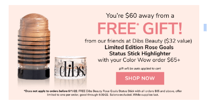
There are tons of options for what constitutes a gift with purchase; it can be a product accessory (think luggage strap with a bag), a mini-version of another product, etc. Add these gifts to their cart with a one-click CTA directly in the pop-up after they opt-in to the lead capture or complete another desired action.
One of our favorite versions of this actually involves the gift being from another company as part of a brand collab. Partnering with another brand whose target audience aligns with yours is a great way to build a powerful visual story driving interest and engagement while unlocking new audiences for you both.
3. Product Upgrade/Customization
Sometimes, it’s the little something extra that grabs a shopper’s attention. In fact, customization for some products can be as good if not better than a discount. For example, offering free monogramming on luggage or an upgraded case for sunglasses.
This is a great strategy for lead capture as well as cart abandonment prevention. As soon as someone adds the target product to their cart, fire this message prompting them to make their selection.
4. Brand Swag
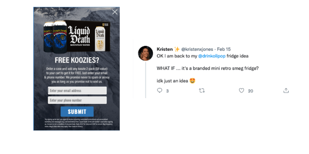
Branded merch is great because not only is it free marketing when it’s out in the world but can help deepen the brand connection with every use. There are many DTC brands out there with a cult-like following where sometimes the exclusive swag is more sought after than the products themselves! This is one that can be done as an entry-level incentive for TOFU traffic or reward big-spenders and long-time customers!
5. Early Access
This is especially popular around the holiday season when brands who don’t want to engage in the typical race to the bottom opt for a more elevated approach. Subscribers will get early access to something in exchange for their email or SMS. This air of mystery and FOMO, if you don’t sign up, is perfect for driving strong engagement. Again, this doesn’t have to be early access to a sale, just something: limited-edition releases, new seasonal merchandise, etc.
6. Exclusive Products/Access
Justuno makes it simple to display exclusive access to your VIP audience segments. We’ve seen a lot of brands leverage limited-edition product lines as the incentive for lead capture (for example, peppermint-scented body wash)–that aren’t available for purchase otherwise. The same goes for colorways or other product variations that a brand might make. This works well for not just top-of-the-funnel (TOFU) based opt-ins for lead capture but also in the BOFU for loyalty programs to encourage certain desired actions or additional zero-party data collection.
7. Membership Program
This can be a great way to maintain an elevated status with onsite promotions while still offering something tangible to select visitors.
Lululemon is a premiere workout brand that notoriously doesn’t offer discounts to customers. Despite this, they recently launched a new loyalty program where $128 a year gives users access to exclusive experiences, free shipping, and a 20% birthday discount. If you’d like to start offering something similar, but only to certain audience segments, you can use dynamic targeting rules to hone in on a small but loyal subset of your customer base.
8. Buy Now, Pay Later (BNPL) Options
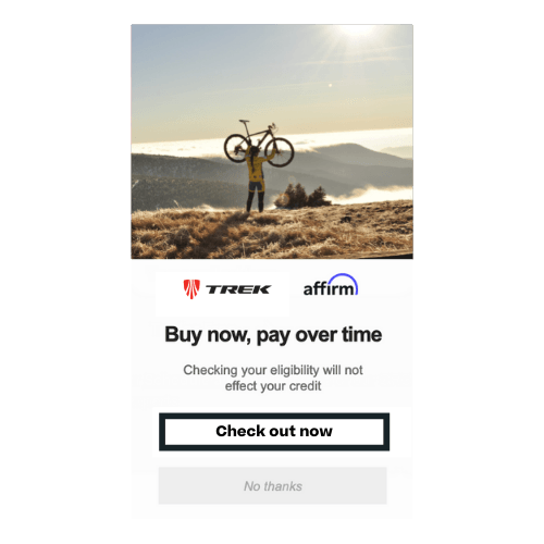
BNPL has become one of the biggest game changers for e-commerce brands; between the flexibility in payment and streamlined checkout experience it offers consumers—it’s no surprise. 31% of BNPL users said they would abandon their cart entirely if it weren’t an option, so make sure that you’re surfacing its availability early & often on your website. For those not offering discounts, a higher price point might be a deterrent for some shoppers. BNPL helps remedy that by making it more affordable for shoppers and doesn’t require a reduction in price on your end. This strategy is great for MOFU to BOFU traffic as their higher intent, and BNPL options will move the needle toward conversion more.
9. Free or Expedited Shipping
If you don’t like offering discounts, you also may not be into offering free shipping, but it’s still worth mentioning! The majority of carts that are abandoned during checkout are left behind during the shipping stage—the unexpected cost of delivery being the usual culprit.
So, if you can offer free shipping. But if not, then use a threshold banner (described more below) to help offset your costs.
For those of you already doing that, try offering expedited shipping for a nominal fee or even as a free upgrade for those with substantial order totals—this “last mile” emphasis is so important for brands to get right. If you don’t, shoppers will just go to Amazon and order an alternative product with free, 2-day shipping, and you’ll have missed out.
Elevated Placement Options
1. Displaying In-Page Promotions That Seem Native
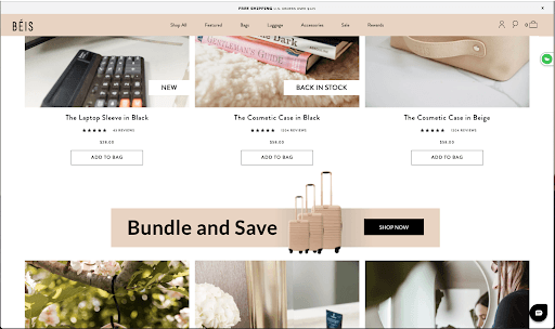
The important thing to know about in-page promotions is that while they are technically promotions, they don’t appear as traditional pop-ups. Justuno’s in-page promotions can be configured to appear as if they are a completely native part of your website. These are a great option for brands who are highly concerned about the interruptive aspect of pop-ups firing during a shopper’s visit but would still like to deliver highly targeted messaging to different segments.
Your options are limited only by imagination: whether it’s a bundle offer + countdown timer embedded in a product collection page, an email newsletter signup that’s a part of your site’s footer, a banner showcasing popular products, 5-star customer reviews, custom HTML, and more are all possible. If you get really granular with these rules, you can even create dynamic website experiences based on traffic source, specific pages visited, onsite behavior, and previous cart contents.
2. Personalized Product Recommendations
Another common application for our in-page promotions is enhancing them with personalized product recommendations. By combining historical customer data with your site’s analytics, our platform can form intelligent product recommendations that appear natively on a page, in the cart, or in a pop-up. The targeted recommendations will resonate with shoppers and can quickly drive increased order values (AOV) for your site.
Our AI-powered product engines make it easy to customize entire sections on your pages and govern which view a visitor will experience. This can completely change the way your site is perceived by different audience segments and provides an advanced level of personalization, requiring minimal effort from your team.
3. Dynamic Banners for Continuous Messaging
Sticky banners are static at the top of your website and follow a visitor as they navigate your site. They’re a great way to display information about your brand, their cart, shipping details, etc., without intruding on browsing. We suggest using them as a form of continuous messaging that reinforces core values about your brand or other important conversion information.
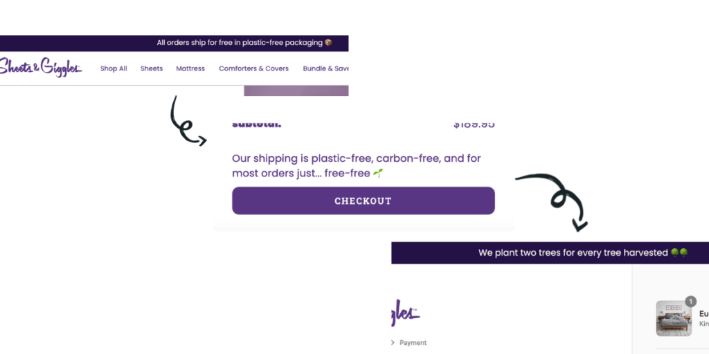
A great example of this is from our customer, Sheets & Giggles; they use a dynamic banner to show a series of rotating messages about their core value: sustainability. This helps visitors get digestible tidbits about S&G while they shop, each of which gives them a reason to not only complete a purchase but feel really good about it.
You can dynamically update a banner to reflect how much customers need to spend to reach a certain threshold based on their cart value. These threshold-dependent offers are a perfect strategy to encourage higher-order values and deeply personalize a shopper’s site experience. This can be great to combine with any of the non-discount incentives listed above or for shipping costs!
4. Geo-Targeted Messaging
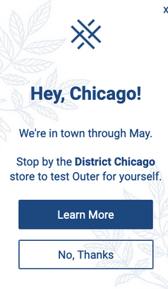
Thanks to Justuno’s advanced geo-IP technology, you can even geo-target the promotions to display only for visitors within a certain area. This could be a great way for those with brick-and-mortar retail locations to unite their online experience with the in-person one for a seamless and immersive buyer’s journey. For those who are doing more event activation-type marketing, you can use these to promote local meet-ups, pop-up shops, etc., to drive foot traffic and build a sense of community!
5. The Corner Tab
This is great for both mobile and desktop traffic since it’s low-profile and lets the website visitor be in charge of their experience. Use a tab to display whatever message you want, for example, “Free Personalization”, then when a visitor clicks on it, a larger pop-up appears with more information and action items. If the visitor closes out of it, the bubble/tab will reappear and follow them as they navigate your site, so it’s available when they’re ready to engage again. This is great for lead captures (you’re getting higher-intent subscribers), more in-depth messaging like the rules for a giveaway, as a reminder for loyalty program/referral actions, and more.

Non-Discount Strategies That Create High-Converting Website Experiences
A brand’s identity is going to be most clearly embodied on its website, which is why any onsite messaging you create is so important to get right. You’ll be on-brand as long all your efforts work towards your common goals and present a unified front.
Discounts don’t work for everyone, and offering an incentive isn’t a requirement for the effective use of pop-ups on your website. While we strongly advocate a sort of quid-pro-quo, if you’re asking the visitor to give you something, it’s only fair that you provide value in return. But what that is, is entirely up to you and what your target audience values.
In the end, pop-ups are neither good nor bad–it’s how you use and target them that matters. A well-designed, highly targeted pop-up that provides real value to a shopper will never be off-brand.
Ready to see the Justuno difference? Start a free 14-day trial to see how you can elevate your website experience using one of our many pre-built templates (non-discount strategies included).
