Landing pages are one of the most commonly used marketing tools but why? Because they work! Or at least…they work when they’re executed correctly.
A high-converting landing page for your e-commerce brand is one that delivers value, distills information and asks just one thing of your visitors.
Let’s dive into what that looks like in these real-world examples and suggested types of landing pages you can create to grow your business.
What Are Landing Pages?
Landing pages are standalone pages on your website created with a singular goal in mind, to convert your traffic. Now you may be thinking…isn’t that the point of my whole website?
Yes! But landing pages distill all that your website has to offer into a more digestible format, created solely for a specific audience to push them towards a certain action.
The only thing for them to do on that landing page is convert so these visitors tend to convert at a higher rate making landing pages ideal for paid traffic and other marketing efforts.
Landing Page FAQs
Well if your brand uses a lot of ads or other paid traffic acquisition they are a good way to increase your ROAS. Plus limited-time campaigns or last-minute ideas can be pulled off easily using landing pages.
It can be—but landing pages can be used to achieve a variety of website conversion goals. The key points are that there is only one CTA, the language is extremely targeted for the audience, site navigation is removed or minimal, etc.
Depending on how you create your landing pages there may be some dev work involved such as setting up a sub-domain but there are also low to no code options available.
10 Examples Of Landing Pages + Their Strategies
As we said earlier, landing pages can be used to reach a variety of website conversion goals for brands. Let’s dive into some examples of those landing pages and what they can be used for!
Event Registration
The nature of landing pages being non-SEO optimized and for a limited time use makes them the perfect way to add event registrations to your website as you need. Whether you’re hosting a pop-up shop, online webinar, or a charity drive—use a landing page to gather registrants for your events with ease.
Product Drop
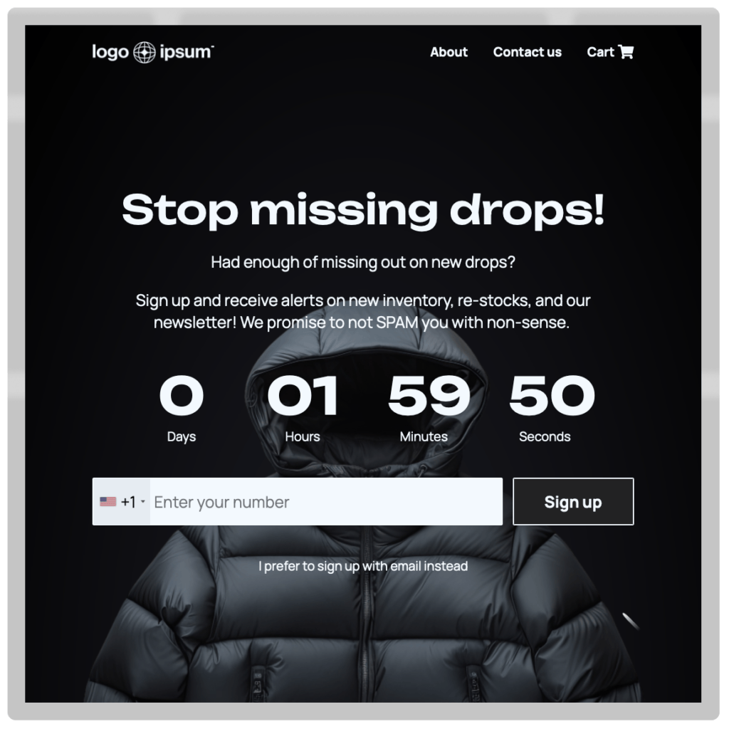
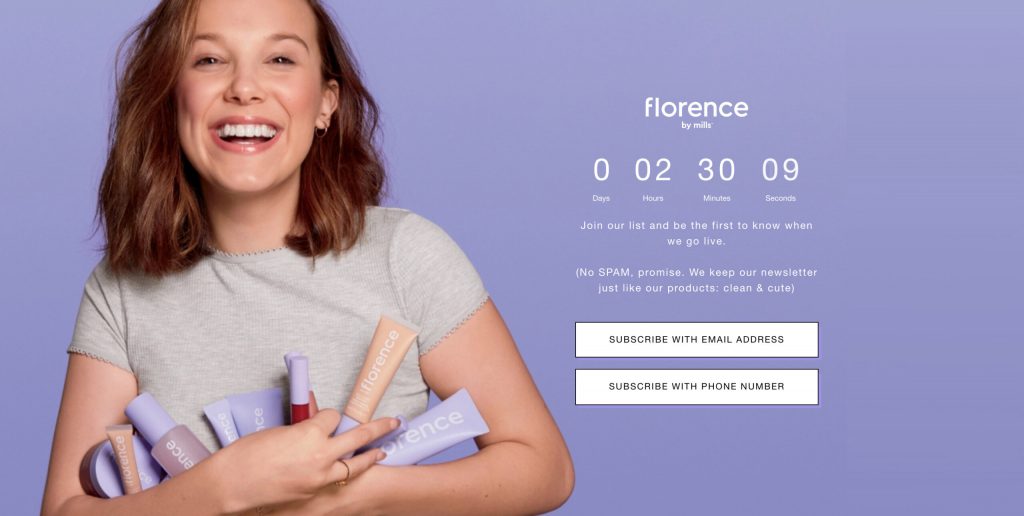
Create buzz and gauge interest before a new product or collection drops with a landing page counting down to the launch date + email or SMS opt-ins to collect a list of high-intent buyers.
This example from Florence by Mills was actually for the entire brand to launch but the same strategy can be applied to singular items or collections. Gate the page or website with the full-page takeover and watch your subscriber count soar!
Simple Product Page
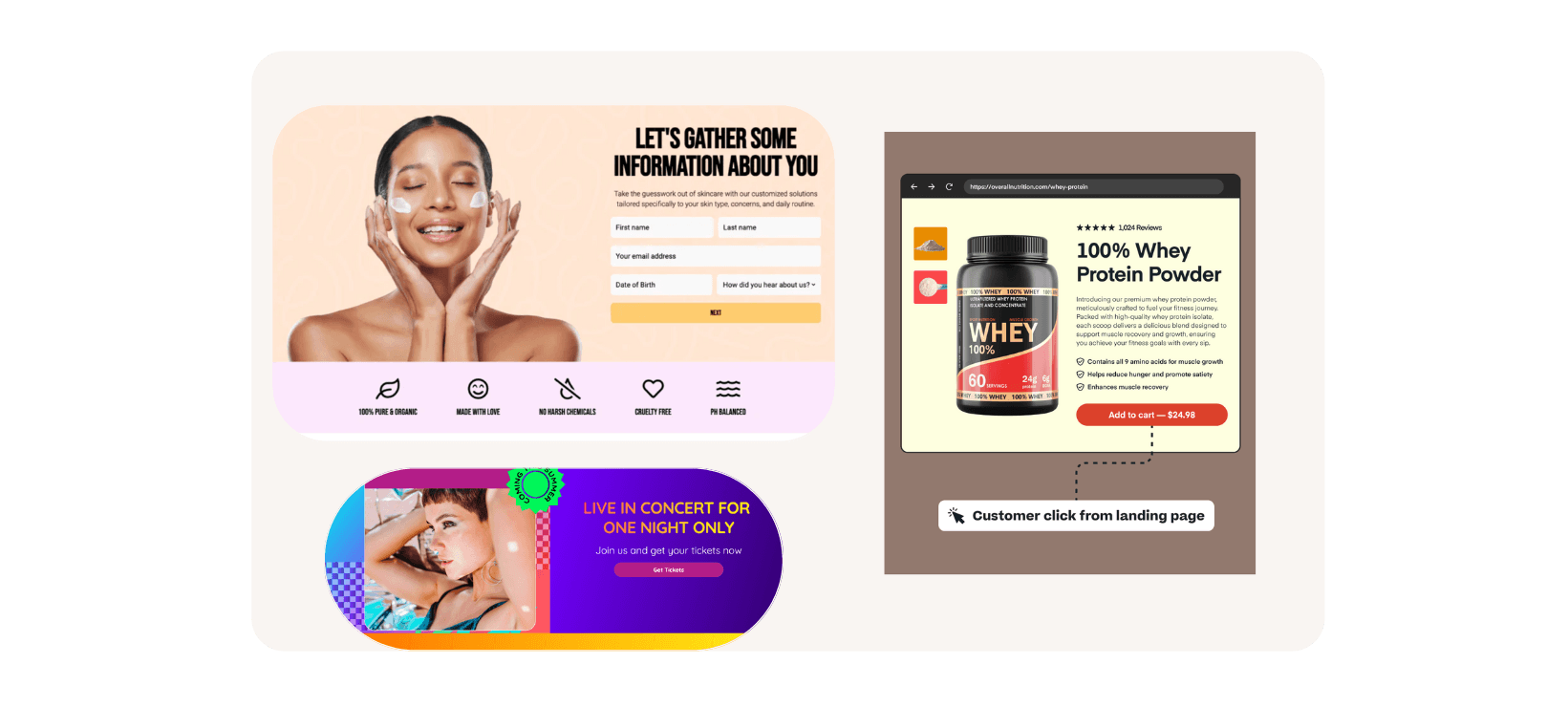
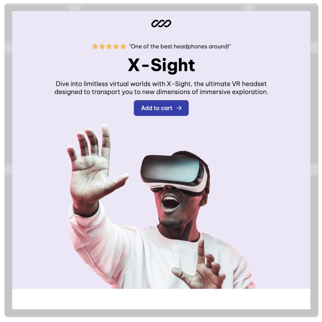
A distilled down PDP? That’s a great reason for a landing page. Especially when used for re-targeting ad traffic. Once they click through they’re shown a sleek product page with key features/differentiators, social proof, and the buy now option.
Get these return visitors to focus on the ultimate goal of conversion to maximize your ad dollars and keep their eyes on the prize with minimal distractions.
Product Recommendation Quiz
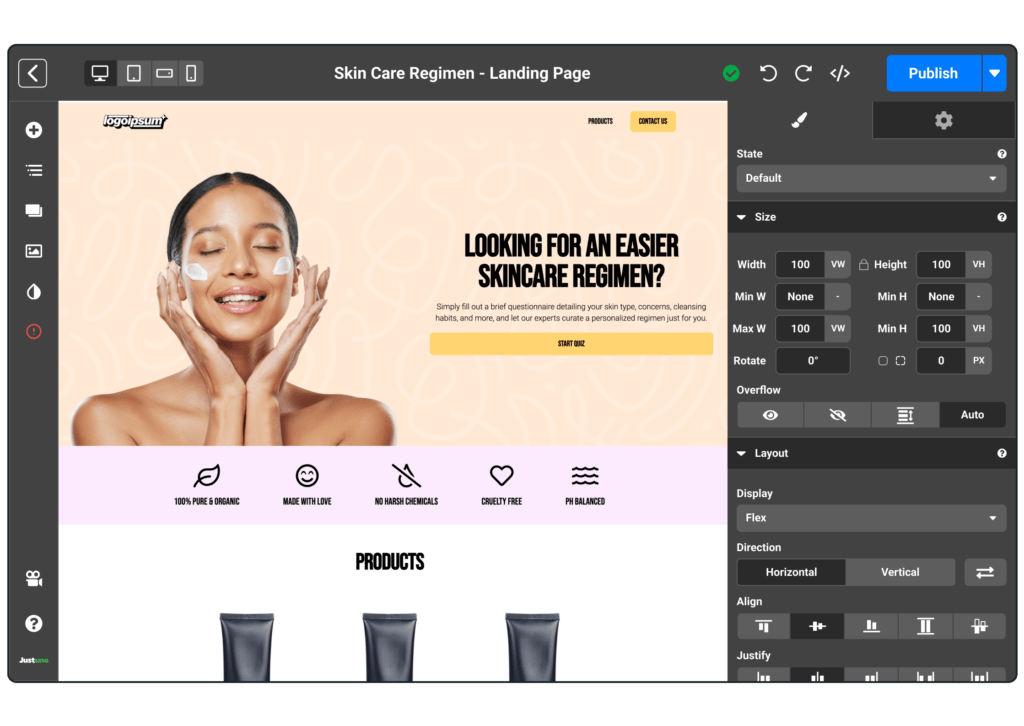
Want to create something more top-of-the-funnel for first-time visitors from ad campaigns? Increase their odds of purchasing on the first visit by using a product recommendation quiz on your landing page. You’ll be able to collect valuable zero-party data about them while also providing them with a tailored, personalized experience designed to convert.
Remove choice paralysis and provide reassurance that the products they are shown are the right ones for their needs. Combine this with some social proof and you’ll turn a first-time visitor into a customer effortlessly.
Exclusive Offers
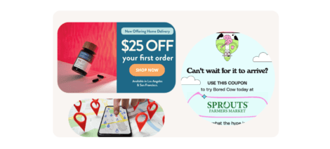
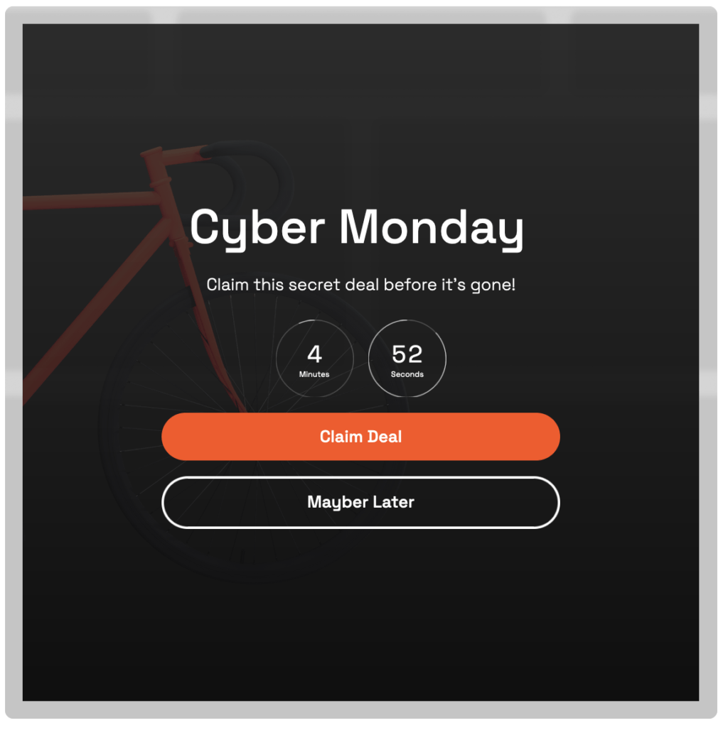
Have an ICP audience that you want to convert with a sweet deal that not everyone should get? Use a landing page! Regular product pages can be hard to properly display discounts or special offers on and using a page designed around the offer for a specific segment will yield stronger results.
Emphasize the limited-time nature of the deal and the exclusivity to give visitors FOMO if they don’t redeem their offer. The example below does this well using a countdown timer and “secret deal” language—making the shopper know they’re part of a select few.
Giveaway
This can be filed under another list growth strategy to use on your landing pages. Giveaways are a great way to supercharge your email or SMS opt-ins without offering a discount on every order. For those with big-ticket items or low margins, this may be the best option you have for opt-in incentives.
Alternatively, if you’re running a short-term brand collab or just testing the waters with a giveaway—landing pages give you the flexibility you need for short-term messaging and highly segmented audiences.
Age Verification
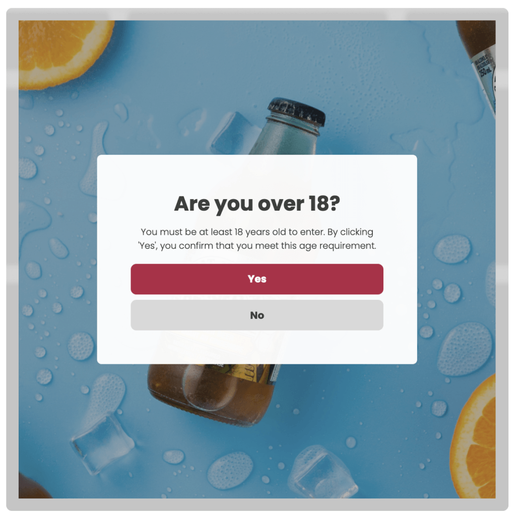
This landing page can be a form of lead capture but doesn’t have to be. For those who sell regulated goods such as alcohol, vapes, CBD, etc. you’ll have to use an age verification pop-up on your website to confirm your traffic is of age to purchase your products. But you can turn this into a landing page for maximum gating effectiveness + a personalized experience.
The example below has a great image as the background to provide a branded experience to start and immerse new traffic into your website while you handle compliance needs.
In-Person Event/ In-Store
Tie your in-store experience with the online one using QR codes in packaging or event/store signage. QR codes can be used to trigger specific landing pages that could offer more information, collect buyer info, find size/color options, etc.
As more brands create in-person events, launch into stores, etc. it’s important to figure out how to create an omnichannel experience for your customers. Landing pages can help bridge that gap and when done on a by-event, product, locale, etc. basis it can be easy to personalize and delight shoppers.
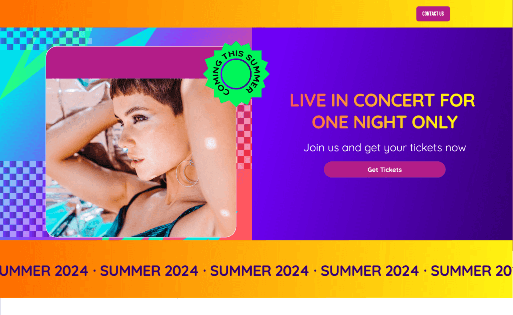
Use geo-targeting to target specific audiences so these landing pages contain only the most relevant info. For example, concert dates and line-ups like the example above can change as tours move from city to city.
List Growth
Grow your email or SMS lists using landing pages for a variety of audiences. Targeted language, specific offers, and even imagery can be tweaked to ensure maximum opt-in rates from your click-through traffic.
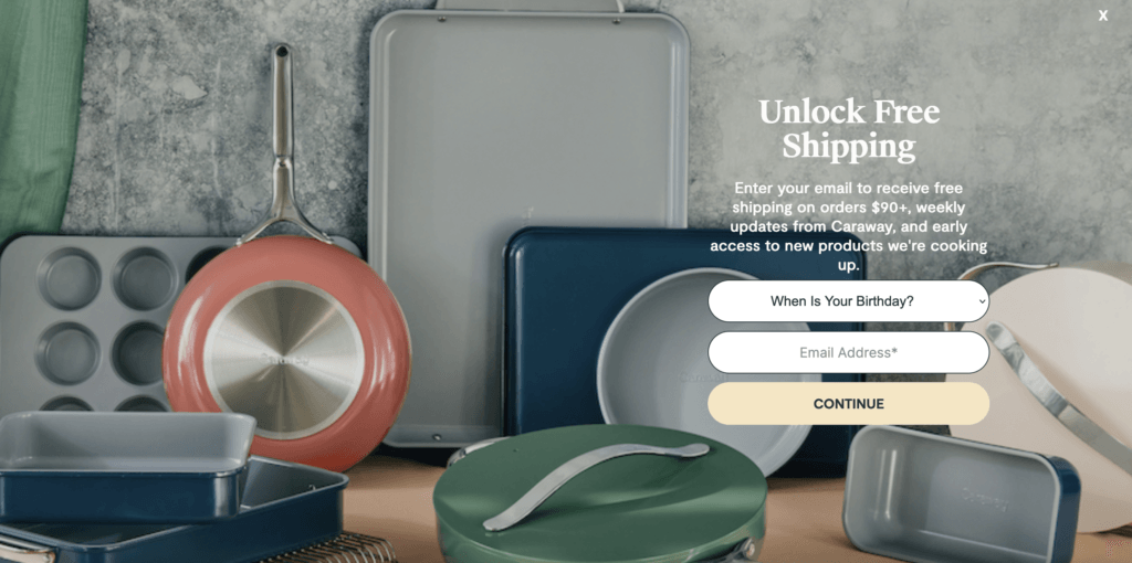
We’ve suggested a few types of incentives (both discounts & non-discounts) in this list that can be used for list growth but others include:
- Traditional % or $ off discount
- Free samples or gift
- Contest entry
- Content downloads
- Free shipping
- And more
Subscription Program
If you offer a subscription program use a landing page to convert more visitors into subscribers to boost lifetime value. Remove distractions and let visitors focus on the benefits of your program or building their first box.
Re-target first-time customers to drive them back to your site to encourage a second purchase faster or simply prospect new audiences and funnel them directly towards your more profitable SKUs.
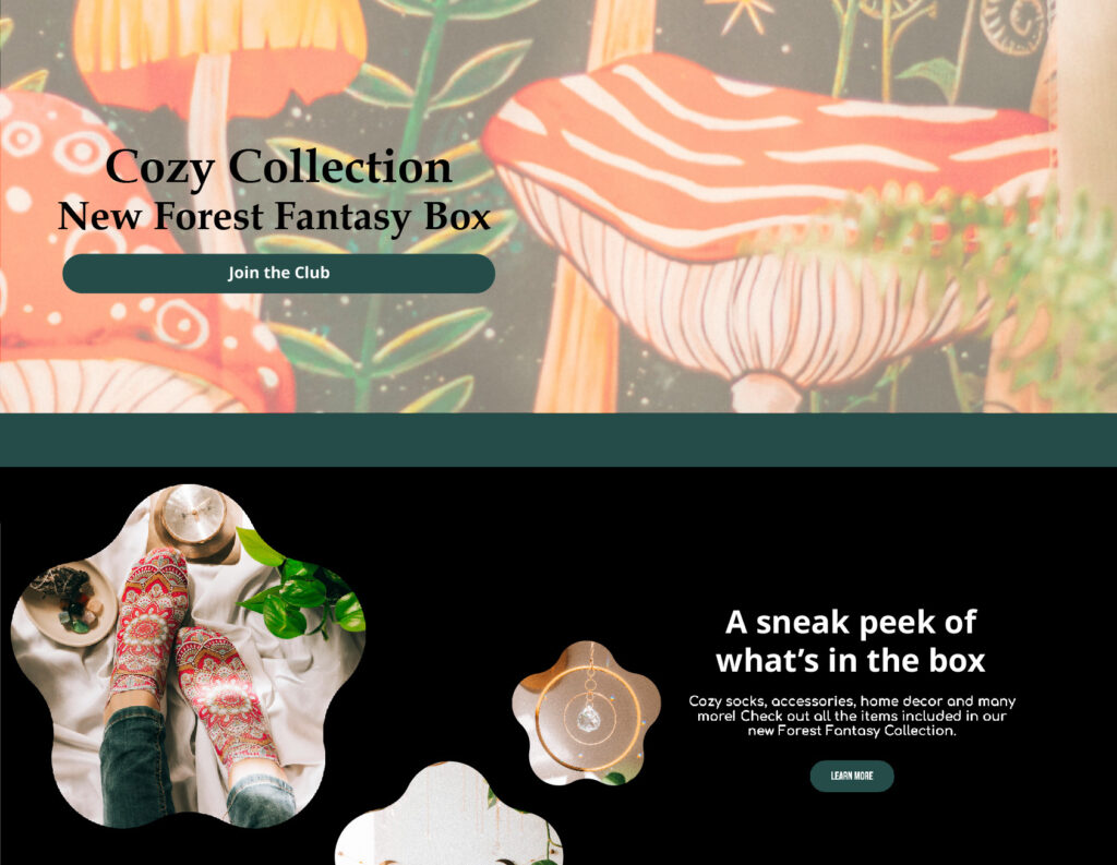
Landing Pages Justuno’s Way
Justuno’s landing page feature enables users to launch new pages quickly and easily with the same level of dynamic personalization that your pop-ups have.
Pro Tip: Check out our top use cases page featuring 3 live landing page examples to see them in action in real life!
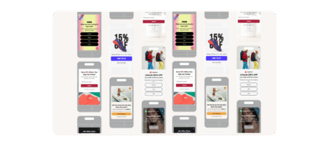
Our high-performing designs can help you implement all the strategies outlined above in just a few minutes using our template library.
Here’s why a Justuno landing page would work for you:
- Ease & flexibility to design a branded landing page for segmented traffic
- Ability to add landing page experiences to pop up workflows
- Enable landing pages with targeted rules vs. URL rigidity
- Templates ready to use for speedy launch
- The option to use personalized elements live on the page, like name, region name, influencer affiliation, etc!
Justuno’s way removes all dev resource needs for sub-domain set-up or maintenance. Landing pages traditionally can require more upkeep than you may want while Justuno’s full-page takeovers remove the need for all that. Avoid redirects, nav or footer changes, etc.
In the same vein, simply turn on and off your designs when you run your campaigns. Our targeting rules give you maximum flexibility compared to rigid URLs from traditional pages.
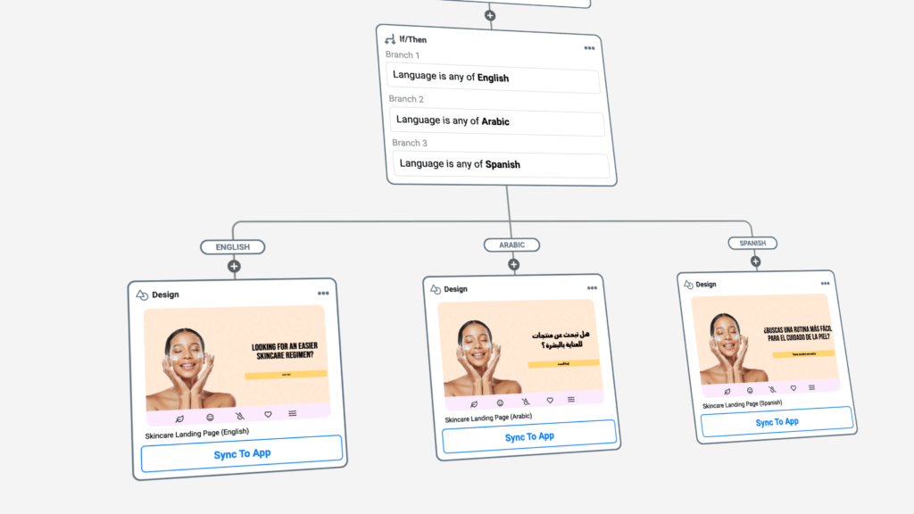
Keep your pages organized by campaign within a single workflow with if/then logic automating the customer experience. Based on the action a visitor takes while on the page you can automate what happens next including adding them to a segment, syncing data to other apps, triggering another display, or simply adding data points to their profile.
Finally, our template library is full of designs ready to be customized and set live in a few minutes!
Pro Tip: If you’re a Justuno user and need help setting up your landing pages, check out our full support article here.
Landing Page Takeaways
When it comes to online shopping, the landing page is like a virtual shop window. It’s where potential customers decide whether to step inside and explore further or click away. Creating a landing page that’s easy to navigate, showcases products effectively, and speaks to customers in a way that resonates with them is crucial for e-commerce success.
By continually refining and improving these pages based on what works best, brands can build stronger connections with their audience and drive more sales. So, while it may seem like a small detail, the impact of a well-designed landing page on an e-commerce brand’s bottom line can’t be underestimated.
Ready to try Justuno’s landing page solution? Book a call with our team to get started!
