AI-powered or intelligent product recommendations sound like something only big brands can afford or something that must be incredibly hard to implement, right? Not at all.
You can implement these on your website using Justuno’s intelligent product recommendation engine. But let’s take a step back at what personalized product recommendations are and why they can improve conversions and overall customer experience. Plus, some tips and suggestions for using them and how to get the most out of your e-commerce store’s product recommendations.
What are Intelligent Product Recommendations
Intelligent product recommendations are from AI-powered recommendation engines that aggregate data to show website visitors different products based on their underlying algorithms or filters.
Justuno’s intelligent product recommendation engine features five algorithms and ten filters for maximum personalization and customization.
The five algorithms are:
- Upselling, cross-selling, most purchased, recently viewed, and most viewed
While the filters are:
- Date added, brands, products, force include, discounted, price, tags, categories, stock, and show “out of stock” items.
Create a set of rules for your Commerce AI promotion using the algorithm of your choice alongside whatever filters you want to create a dynamic onsite shopping experience.
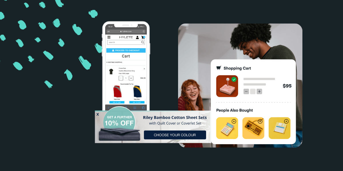
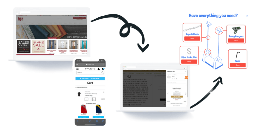
Then you can place these intelligent product recommendations anywhere on any page of your website, from the home page to cart and checkout, even within a pop-up. It simply depends on your strategy and goals for each recommendation.
Why Should You Use Intelligent Product Recommendations
Intelligent product recommendations are a highly effective way to inject personalization into your website that improves your user experience, product adoption, and increases both the average order value (AOV) and overall conversion rate.
Think about your own shopping experience: someone recommending another pair of jeans similar to the ones you tried on first, the matching earrings next to the register for the necklace you’re about to buy, the sprinkles in the aisle next to the ice cream case, or even being asked if you’d like to purchase an extended warranty for your electronics. Each of these is an example of a product recommendation and can be translated into online shopping. However, using product recommendations online is even more effective as they are based on detailed data points collected from thousands of users.
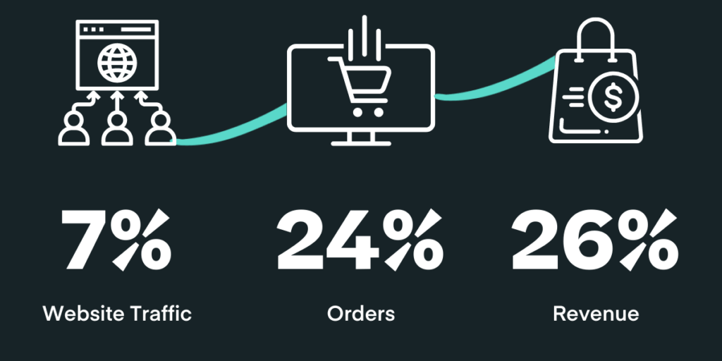
According to The Good, website visits where a product recommendation was clicked make up only 7% of website traffic but account for 24% of orders and 26% of revenue. That’s a more than 3X increase in conversions and dollars compared to the percentage of traffic.
In addition, Justuno Plus users averaged a 35% conversion rate on their Commerce AI promotions last year and an AOV of nearly $175.
If the stats on intelligent product recommendations themselves don’t convince you, consider the personalization aspect. According to Shopify Plus, customer satisfaction rates are 20% higher for brands with an emphasis on personalization, with a 10-15% boost to their conversion rates as well.
Now that we’ve defined what intelligent product recommendations are and why you should use them let’s jump into how to use them with Justuno alongside strategies for implementation.
Some of these tips will work better for your store than others, but let this list act as a general guide to implementing intelligent product recommendations effectively. As always, we recommend you A/B test your onsite strategy consistently since every e-commerce store and its target audience is different!
Justuno’s Best Practices for Intelligent Product Recommendations
- Have an equal number of products included in the carousel. If you’re only showing one product at a time, this doesn’t matter. But, if you’re showing between 2-4 products (which is the sweet spot), make sure that you have enough products included to fill out the carousel each time. When clicking through the items, a blank spot in the carousel can appear broken to the end-user, while in reality, you only had five products that met the algorithm’s criteria.
- Make sure your product pages and e-commerce backend are set up properly. This applies to several points since your intelligent product recommendations are only as good as the backend information being fed into the engine!
- Consider your product images. If you have the alternate upon hover feature turned on, the second photo available for the item will appear when a visitor hovers over the product in the carousel. If you have some items that don’t have a second photo, then nothing will happen upon hover, which could be seen as a glitch. Ensure your product photos are up to date, and consider turning the alternate upon hover feature off if you have a lot of products with only one picture available.
- The tags and categories filters are a great way to create high-performing product recommendations. For example, a deodorant company that has seasonal scents can create recommendations that change what scents are showing based on the time of year. In this case, you could tag the rose scent as summer and the peppermint as winter. However, these filters are only as powerful as the backend setup of your e-commerce platform. If you haven’t cleaned your tags out or been on top of assigning them, you may see the wrong items being recommended.
- If a product is sold out and you don’t intend to collect pre-orders or restock, make sure it’s marked as sold out on your e-commerce platform. Otherwise, the recommendation engine has no way of knowing to exclude it. On the flip side, if you do sell out of something and want to continue selling it via pre-orders, our filter to show out-of-stock items is a great way to use social proof and FOMO to recommend that customers buy it now to make sure they don’t miss out on it again.
- Don’t rush the process. For example, don’t throw a recommendation template up and be done with it just to say you have one. Take time to understand the customer journey and care about actually meeting your customers’ needs. This will not only improve your marketing but also help when choosing where to place recommendations and their base algorithms to reach your goals. Here are some suggestions for where and when to use each of Commerce AI’s five algorithms:
- Most Purchased = Place a carousel of best sellers on your home page. This will help introduce customers to items they may not have thought to search for and hook their attention the moment a new visitor lands on your site. Additionally, the “best sellers” aspect provides indirect social proof giving new traffic the confidence to purchase, which is the key to a same-session conversion off of a first-time visit.
- Recently Browsed = Great for maximum personalization based on the individual visitor’s behavior and using relevancy to drive impact. This can target return visitors/customers and can be useful on middle funnel product description pages (PDP) or in the cart at the bottom of the funnel.
- Cross-Selling = The most commonly used algorithm in Justuno’s intelligent product recommendations with the suggestion of complementary products to what the visitor is browsing or added to their cart to encourage them to purchase additional items. Cross-sells are great essentially anywhere on your site, work at every stage of the customer journey, and can be customized endlessly. In-cart and on-checkout are particularly high-converting strategies for last-minute add-ons.
- Upselling = A great choice for those with several variations of the same product, high-value items that tend to have warranties, etc. These suggestions of upgrading to a more expensive, fully loaded version of what the visitors were browsing increase AOV through the substitute product recommended and can be solid drivers of increased customer satisfaction and lower returns since they upgraded the first time around.
- Most Viewed = Similar to most purchased but speaks more to top-of-the-funnel browsing behavior. This can be helpful if you’re more focused on getting visitors to click through more pages and less on the actual sale itself (not a bad strategy, just different!); in fact, Justuno Plus pop-ups increase average time on site by 196%!
4. Putting product recommendations in-page makes them appear native to your website and creates a more seamless process. Plus, they won’t cover up or impede any conversion activities by “popping up” and potentially interrupting their journey.
Here are a few ideas for where to place intelligent product recommendations in-page:
On Blogs (Carousel or Single)
If your brand has a blog or other content hub onsite, then in-page product recommendations are perfect for adding personalization to the onsite experience for readers and can be placed anywhere on the page for a seamless/native look.
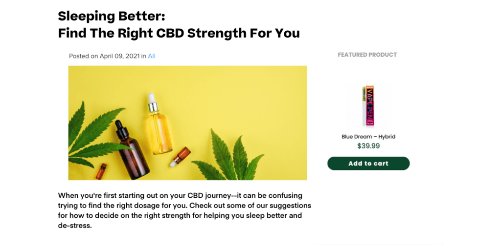
Whether you add the full carousel to a blog or choose to highlight a single product along the side, these placements create easy access for readers when they want to add the products being mentioned to their cart.
They’ll be able to do so directly within the blog without having to search or navigate away from the page. By removing additional steps for your visitors, there will be fewer opportunities for distraction and cart abandonment, ultimately increasing engagement and conversions.
In-page promotions are easy to set up as well ( no dev required)–so you can implement these any extra resource drain.
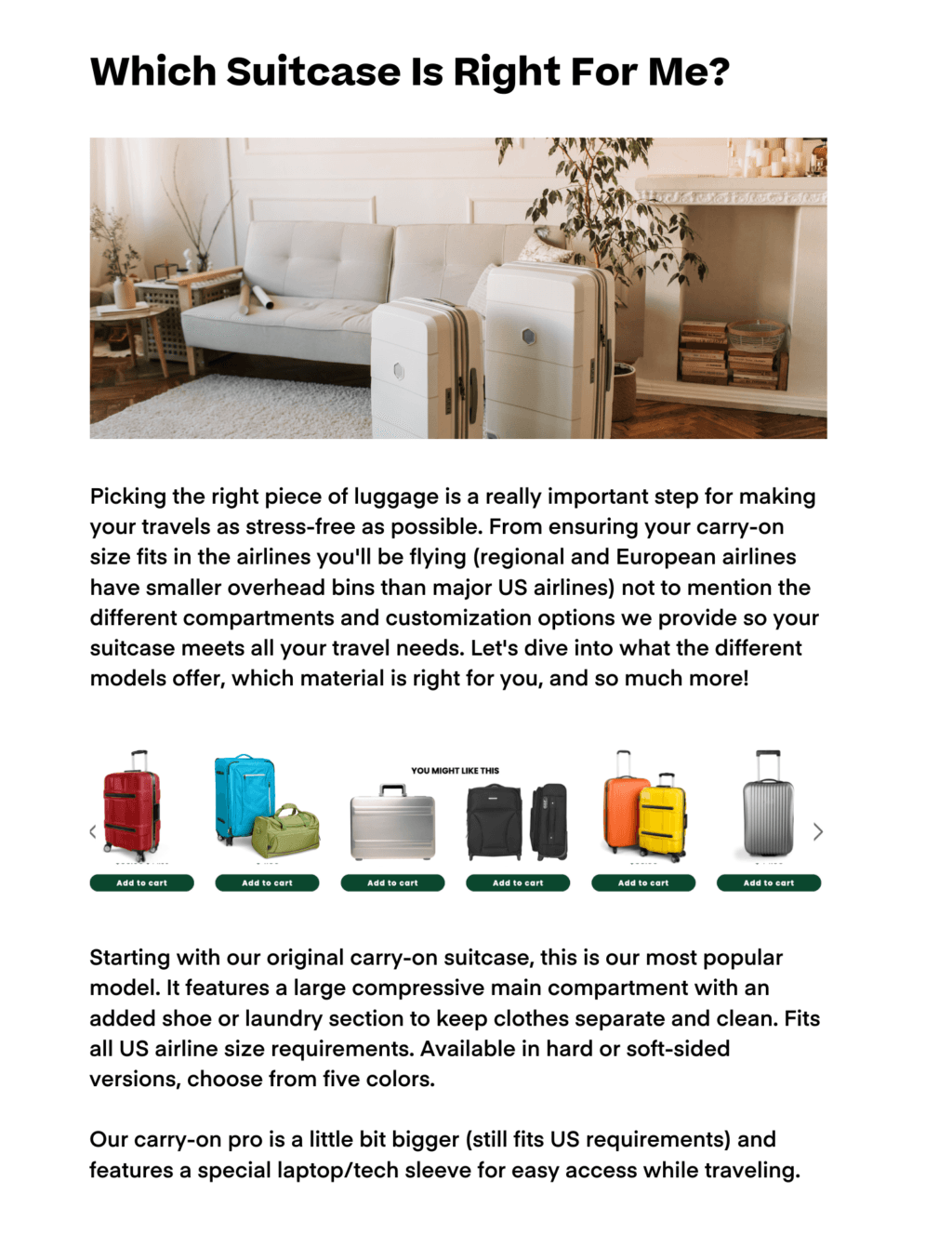
If your blog is on a subdomain or its own domain entirely (so it’s not connected to your e-commerce store), then Justuno’s product rec tool can still be implemented to use as a product discovery tool. Since the product images in the carousel are clickable, they’re just one tap away from your product pages.
On Product Description Pages
This is the most traditional of all the product recommendations placements, and for good reason!
Product description pages (PDPs) are a no-brainer for showcasing related/similar items to improve the likelihood that the visitor with find the right product(s) for their needs. Place these a little below the fold (or just key details) so that those looking to learn more will see them and have easy access to a personalized collection of options!
We say below the fold/key details because the top priority of a PDP should be to showcase the product itself & drive the visitor toward the goal action of adding it to their cart! But as always, A/B test different locations on the PDP to find the best spot for your target audience.
For example, Stegmann, a footwear retailer, used product recommendations both on product pages and in-cart for comprehensive bottom-of-the-funnel activation. Their product recommendations average a 31.49% engagement rate and a 22.75% engaged conversion rate!
This is not to say you should ONLY ever place these recommendations in-page – every situation is different – and depending on the end goal, it may be more effective to have a pop-up appear with the product recommendation carousel.
Here are a few ideas for when to place intelligent product recommendations in a pop-up:
Corner/Side Slide-out
These are best to do with only one item showing at a time so you don’t take up much room on the page and focus their attention. Once someone adds an item to their cart, you can trigger this or welcome a returning customer back with a recommendation based on previous orders on what to browse this visit. Corner slide-outs are also great when someone is on your site for a long time but hasn’t added anything to their cart. This would be aimed at helping shoppers find what they’re looking for since prolonged browsing may mean they need a little nudge. Use targeting rules like “percent scrolled” or” time spent” to trigger the slide-out and include a direct add-to-cart CTA or take them to a high-converting collection to explore and learn more.
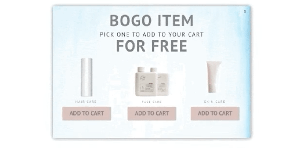
Center Pop-Up + Free Gift
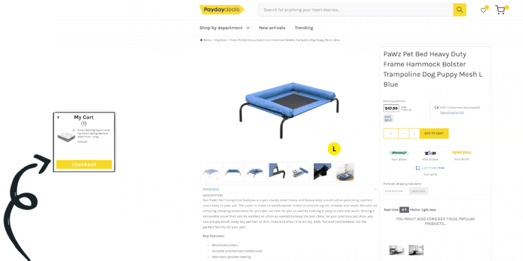
If you’re running a free gift with purchase promotion and someone adds a qualifying item to their cart, fire a center pop-up (yes, we know it’s interruptive) showing them a recommendation carousel of their free gift options. The reason we’re saying center pop-up is because selecting the free gift they just unlocked is a great reason to interrupt their session and gives them ownership over the prize, ultimately making it less likely they’ll abandon their cart for fear of missing out on what they’ve “earned.” These can also be effective as a slide-out pop-up so A/B test to find the most effective location for your audience!
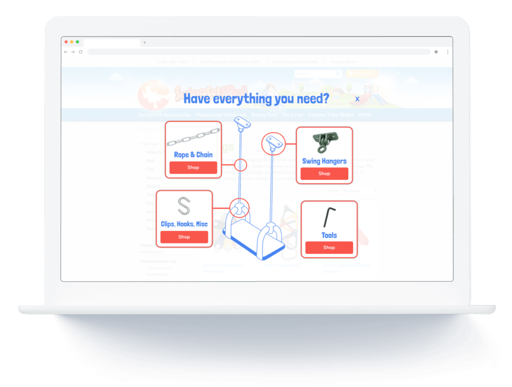
Center Pop-Up + Cart Abandonment
Another time to use a center pop-up is when you’re trying to re-engage a returning abandoned cart visitor. Show them not only the items they left in their cart previously but a few related ones to pique their interest on this latest visit so they can pick up where they left off.
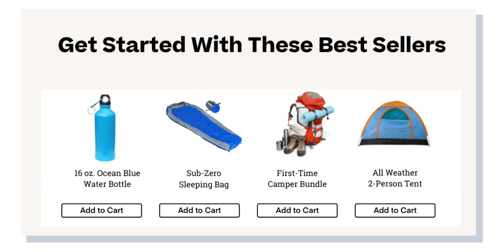
Email Lead Capture
On the post-engagement screen of an email pop up, show a most purchased recommendation to encourage the same session conversion using the offer they just got for signing up.
5. Cart and checkout pages are one of the final opportunities to show a product recommendation and are one of the most effective placements. Here are a few suggestions on what to do (and what not to do) when targeting the bottom of the funnel:
- A/B test a few placements and layouts to find the right size/location for your store’s cart page. It can take time to find the right element on the cart page to target for an in-page recommendation. If you’re targeting the checkout page, make sure not to interrupt the shopper’s checkout flow before the final point of conversion, as you’ll want the recommendation close to the checkout button for the greatest chance they’ll see it. However, this should in no way cover it or block it from view.
- Make sure checkout page recommendations are not below the fold where you’d have to scroll past the ‘place order’ button even to see them. Most customers at this point are only looking for the button to finish up and won’t be scrolling beyond it, making it rare for any recommendations placed below the fold to be seen.
- For both cart and checkout pages, it’s best to keep recommendations as personalized as possible and as closely related to the current cart contents to maximize relevance. For example, cross-sell matching products like earrings to go with their necklace or an upsell to an extended warranty on their electronics.
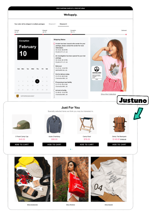
- Include product recommendations on your post-purchase order tracking page (if you have a branded one…you should since it’s checked an average of 5 times between purchase and unboxing, making it one of the most engaged points of a customer’s journey. Place a product recommendation carousel on the post-purchase page that complements their order content with CTAs to easily add them to a new cart with just one click for a streamlined repeat buying experience. The additional exposure to new product releases or collections means these products will be top of mind the next time they’re shopping on your site, even if they don’t lead to immediate secondary conversions!
6. Finally, here are a few frequently asked questions about Justuno’s product recommendations and the ins and outs of setting it up:
- Why do recommendations have multiple rule sets? Product recommendations are the only layer in Justuno that has two sets of rules, one determining what products are shown in the carousel and one determining who the carousel is shown to.
- How often does the most viewed algorithm change based on your store’s sales? The data that powers it changes every hour; that data though is based on the last 7-30 days though, depending on different e-commerce platform variables.
- How long does it take for the engine to be fully optimized on my store? We recommend around thirty days as the sweet spot for our intelligent product recommendation engine to learn the ins and outs of your store.
- How many products should I aim to have in my recommendations? While every store is different, we routinely see A/B tests indicate that fewer products in a carousel are better for overall performance.
- Is there a limit to how many different recommendations I can have set up at one time? Nope! There’s no limit to how many you can have running on different pages. Our recommendations are powerful because you can do more with less effort, but if you want to create extremely customized onsite experiences, have an extensive/complicated product catalog, etc., then you may need to create more than the average Justuno user. We’ve had some customers have over 50 different combinations of our recommendations running to achieve their ultimate conversion and revenue goals!
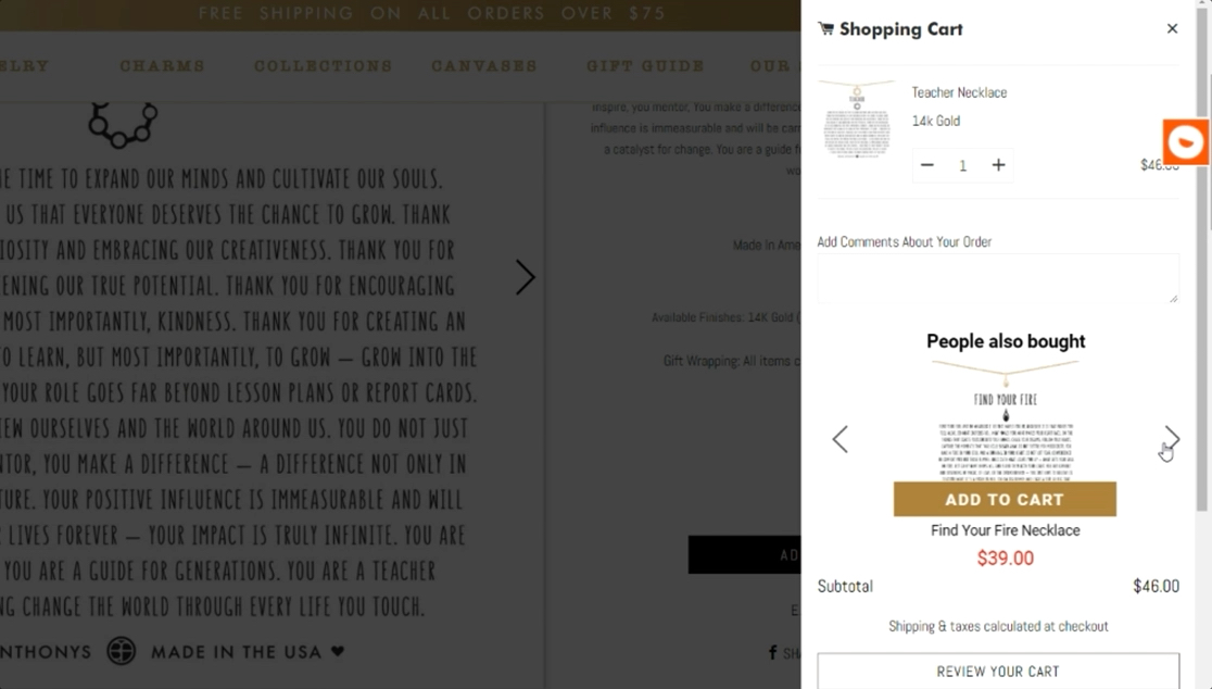
- Can I display product recs in my slide-out ajax cart and not just on a full cart page? Yes, this is a great way to provide a quick, convenient recommendation to visitors, one of our clients, Bryan Anthonys, used these dynamic slide-outs for in-cart cross-sells, which led to a 126% lift in engaged conversion rate over regular email lead captures, an average $8 increase in AOV, and ultimately, a 300% increase in revenue. Check out the Bryan Anthonys case study to learn more about how they implemented a full-funnel onsite experience from acquisition to checkout with Justuno.
- Is it worth putting product recommendations on mobile? YES. Mobile visitors are consistently making up more and more of e-commerce traffic both in top-of-funnel activities like research and browsing but also in bottom-funnel activities like cart abandonment and, ultimately, purchases. You don’t want to miss out on these potential customers and should aim to create a consistent, personalized onsite experience across all touchpoints and devices.
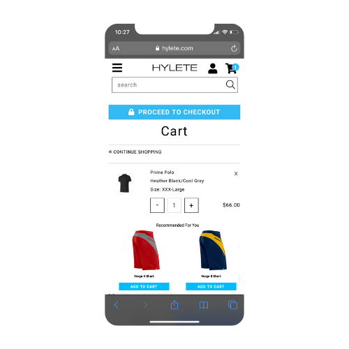
For example, Hylete uses product recommendations throughout their site, including mobile, leading to an average 8% increase in AOV and a 30% engagement rate.
Outside-The-Box Strategies to Supercharge Your Product Recommendations
Beyond the technical and general best practices for adding intelligent product recommendations to your website, there are more creative ways you can approach making these recommendations as effective as possible.
First off, consider the phrasing of your carousels and where a shopper will be interacting with them during their journey. The phrase “Customers who bought X also bought Y” uses social proof to drive action and increases relevancy with their own purchase history data.
Another way to look at this is “frequently bought together” versus “recommended for you”; the second feels more targeted even if the recommendations themselves were the same. If you sell something that heavily relies on social proof or WoM, such as skincare or makeup, then use a “what the experts are loving” strategy to convert return visitors that seem to be just window shopping. “Staff picks” recommendations are just the nudge they need to finally purchase.
Take a look at the big picture, even outside of the Justuno reporting dashboards, if you’re looking to optimize your current intelligent product recommendations. Review your returns and exchanges to see what’s working/what’s not with these; if you see something consistently being returned, you should re-evaluate the targeting strategy for recommendations. Reviewing your order history can also help you identify opportunities for new product bundles to decrease bounce and abandonment rates by combining lower-converting products with higher-converting related items and offering a special discount for them together.
Finally, many Justuno clients are big on using the “force include” filter in their recommendations because they want certain products in front of shoppers (especially those with higher price points or margins). This strategy can work to get more views on less-trafficked products resulting in more sales or in scenarios with very specific targeting rules — but don’t rely on this filter every time. The algorithms are there to see behavioral patterns that may not be obvious, and in the long run, overriding them every time can potentially stunt your results.
Pro Tip: Force Include is the algorithm that allows you to easily show those free gifts for redemption.
Final Thoughts
Intelligent product recommendations are a great addition to any website and can be used in tandem with off-site retargeting for ads and email campaigns to reinforce a personalized, relevant onsite experience for every shopper. They efficiently guide consumers through their full journey from discovery to purchase and back to discovery again.
You’ll provide a better shopping experience through a simple yet highly effective way to inject personalization anywhere on your website.
If you’re already a customer talk with your dedicated Conversion Strategist about new ways to use product recs on your website. If you’re not, request a demo to learn more about our intelligent product recommendations and the many more powerful conversion features available on the Justuno platform.
