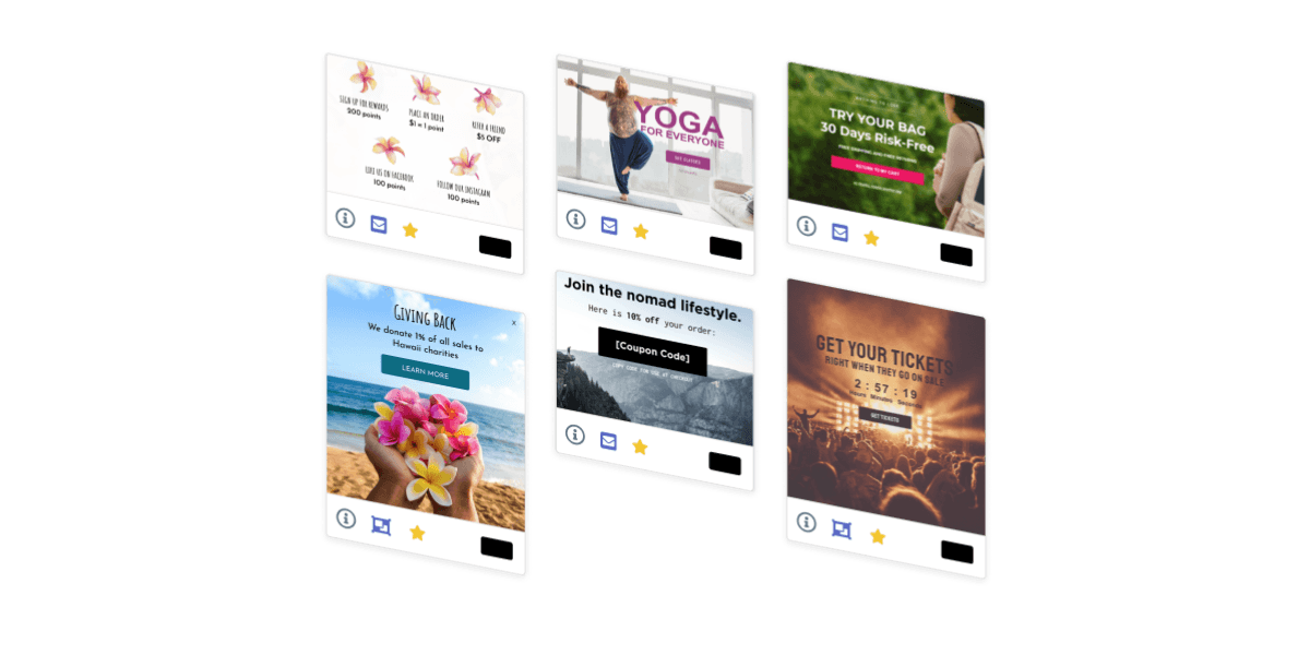
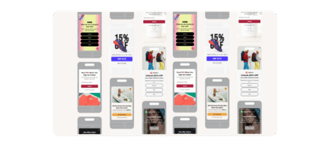
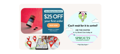
Thanks to the days of the early internet, pop-ups got a bad rap. Think about what just came to mind when you read the word “pop-up.” It probably looked something like this…
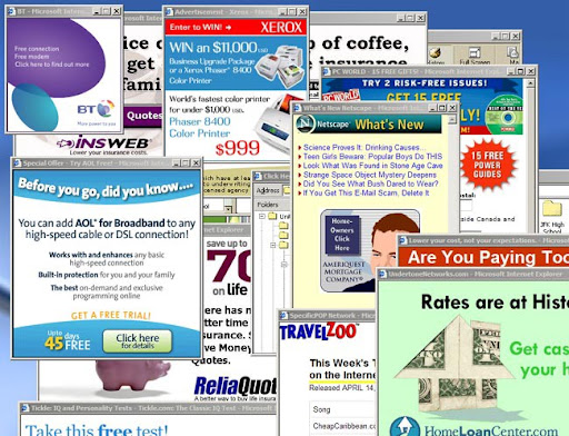
Ugly, unwanted, intrusive, entirely unhelpful, annoying, and spammy. Those are the words that tend to come to mind. That may be where popups started, but they’ve come so far since the early days of the internet, or, at least, for those who decided to make them better.
Pop-ups have evolved alongside the internet, becoming a necessity for e-commerce retailers, online publishers, and SaaS providers alike over the past several years.
Today’s pop-ups can provide personalized experiences, tailored to each individual, and drive significant lead generation for your site.
Pro Tip: Check out our top e-commerce popups live and read more about each use case. Plus unlock templates for each!
They’re so much more than an ad – they’re an expertly designed lead capture for your latest Instagram ad, a banner featuring the countdown timer from your flash sale emails, a fly-out tab for sale notifications, and a product recommendation based on previous orders.
Let’s take a look at what it takes to build high-performing pop-ups that take your onsite experience to the next level rather than an annoying, one-size-fits-all experience for your visitors.
Build Compelling Popups To Collect New Subscribers For Email & SMS
Let’s start with the most common use for pop-ups: collecting new subscribers for your email and SMS databases for consistent lead generation. Email pop-ups are the foundation of every website strategy to collect information from website visitors so you can re-target them with marketing campaigns rather than miss out and let them leave without a plan to bring them back.
This can be a new visitor lead capture, targeting those coming to your website for the first time, or a returning visitor strategy, targeting those who have come before but still not opted in. For those comfortable with offering discounts, an incentivized opt-in is a great way to go. But that doesn’t work for everyone—non-discount strategies include free shipping, free gift with purchase, gated content, and more.
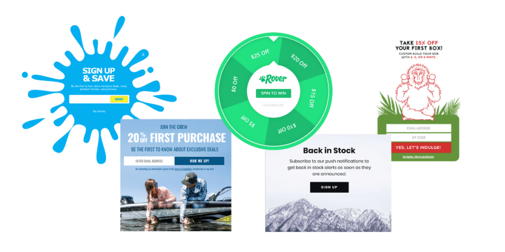
What’s important here is a personalized experience based on where this traffic came from (especially if you’re spending money on paid media campaigns) and what channel you want them to sign up for.
Create different lead captures targeting each paid campaign you have so that the money you’re spending driving traffic isn’t wasted on a less-than-stellar post-click purchase. Target these audiences via UTMs so that each lead captures’ copy, image, or offer to match what they saw in the ad for continuity.
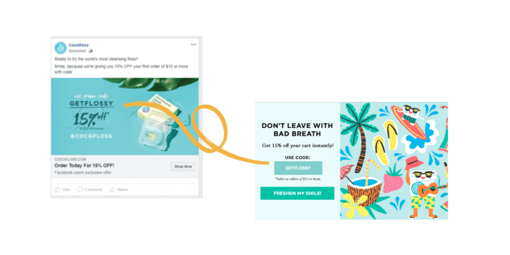
Then, create a campaign for other website traffic, direct, organic, etc., featuring offers and messaging that would appeal to these audiences.
Next up, take into consideration their visit history. For first-time visitors, this is your opportunity to make a good first impression, and for returning visitors, this is a great time to up the ante by offering something of higher value than before. By returning to the site, they’re displaying intent, so this is your chance to seal the deal.
Finally, consider the channel you’re asking them to opt into with an SMS popup. SMS is a fast-growing channel with considerable ROI, while email is still the traditional channel many default to. We encourage a staggered approach based on: the visitor’s device, previous behavior, and your business’ priorities.
- If they’re on desktop, prioritize email. If on mobile, prioritize SMS. Fortunately, SMS collection is made even easier via tap-to-text opt-ins that only require two “clicks” to sign up.
- If they’re a returning visitor that’s opted in to email but not SMS, target them with an SMS opt-in. You’ve had a chance to prove your value to them; now, ask for a more intimate channel to connect on. This even works by waiting until after their first purchase to ask for their number, a perfect combo for shipping and product updates
- Prioritizing SMS growth? You can collect solely numbers from all your traffic or opt for a two-step lead capture with email and SMS fields to collect double the contact potential. Make sure to follow all necessary opt-in policies for SMS collection!
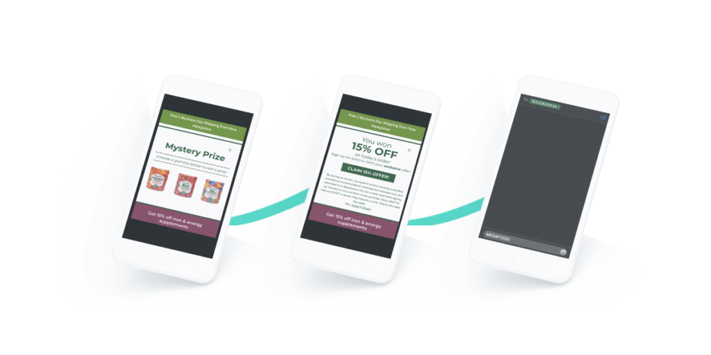
As always, a clean on-brand design is key for lead captures as they can take many forms. The popup appearance should be based on your branding guidelines, device type, and the triggering point in the visitor’s session. Here are some tips for picking the right design:
- Gamified pop-ups are great for collecting first-time visitors’ information; they boast an average 13% opt-in rate and can be customized to be almost anything. Spin-to-wins, mystery prizes, scratch-offs, and slot machines are a few games you can set up, with the possibilities for customization being almost limitless. But this style doesn’t fit every brand and can collect more low-intent leads than other styles.
- Center pop-ups are the traditional style; they’re great for desktops as they’re not overly interruptive and average a 9% engagement rate. These are also great for mobile when created with the proper SEO guidelines in mind and can be set up to have a floating tab appear once closed so visitors who change their mind can easily re-access the offer & sign up. These can also take on a variety of shapes to give them an extra oomph on the screen.
- For brands who want to forgo the “pop up” aspect of lead captures altogether, there is the option for in-page lead capture. This will appear native to their website & allow visitors to subscribe on their own terms as they browse pages. Commonly used as a newsletter subscription option on homepages, in footers across websites, etc.
- Full-screen popups are for those who want an all-in approach. This pop-up essentially functions like a landing page, completely covering the visitor’s screen with your message. Nothing is quite as effective as a full-screen takeover, but they can also backfire. We recommend using these for first-time visitors, referral traffic, highly specific segments, etc.
- Notification Banners can also have lead capture fields in them for a low-profile opt-in experience. We use these on our blogs to allow readers interested in signing up for our newsletter or hearing more about a specific topic from us! See this strategy in action for yourself on this blog.
What To Include In Your Pop Up Form
What fields you ask for from a website visitor are as important as how the pop up looks and the channel it’s asking for. Don’t annoy them by asking for too many things, but also don’t throw away your chance to collect valuable zero-party data.
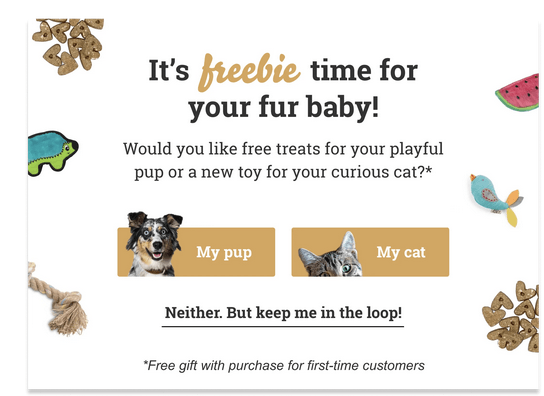
We recommend adding one field for this kind of data that you can use to immediately personalize the welcome flow. What that is depends on your industry and audience.
Our advice is to think of the most important detail you could know about them as your customer and choose that. For example, a pet retailer might say knowing the type of pet is most important, or a beauty brand might say skin type.
Personalized Product Recommendation Popups
Product recommendations have come a long way from a simple “People also bought” with a slightly related item of maybe the same color. They can be used to recommend everything from other items shown in a specific product photo, like a model’s entire outfit, to related accessories and the item(s) a customer bought on their last visit.
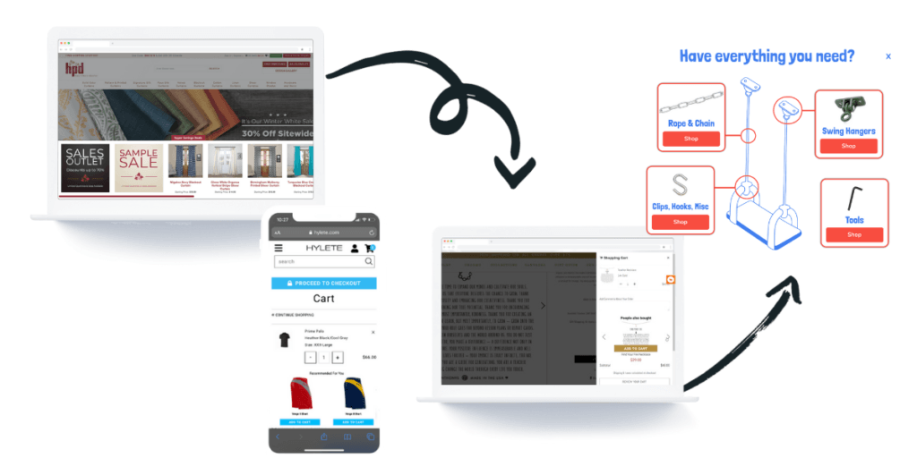
Let’s dive into the placement options & strategy behind product recommendations at every stage in the customer journey:
- New Visitors: Place a best-sellers carousel on your home page. This gives you the best chance of grabbing their attention with your star products and encouraging more pages to be clicked. This can reduce bounce rate and increase time on site, both of which are great for core web vitals (CWV), plus direct traffic to the pages most likely to lead to a conversion.
- Returning Visitors: If they leave something in their cart, you can pull that into a recommendation that pops up when they return. This reminds them of what they were looking at before and increases the likelihood of a conversion. If they didn’t add something to their cart, you can have a carousel of related items on the product pages they browsed to try and lead them to what they’re looking for.
- Returning Customers: Use cross-sells on pages they browse to suggest items related to or complementary to those they’ve already purchased, for example, matching tops to the leggings they bought or the carrying case for the radio they bought previously.
- Current Shoppers: If you’re offering a free gift with purchase and there are several options, trigger a product recommendation upon adding an item to cart. This gives them the chance to select their gift, giving them ownership over what they’re getting and increasing the likelihood of purchase.
- In-cart/checkout: Whether in a slide-out cart or on the cart/checkout pages themselves, cross-sells of related items can fuel impulse purchases for a last-minute AOV boost.
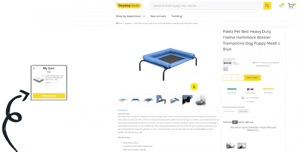
These are just a few suggestions of how brands can use product recommendations for a better website experience, giving your customers popups that delight through helpful, relevant content. Get even more granular through specific targeting rules and e-commerce platform tags for maximum optimization.
Rescue Abandoned Carts & Exiting Traffic With Pop-Ups
Exit offers are another common use case of the pop up targeting visitors exhibiting exit behaviors (via the back button on mobile or breaking the screen on desktop).
Exit offers tend to refer to those who are simply leaving, while abandoned cart promotions refer to those leaving with items added to their cart. They’re typically used interchangeably, but the distinction is important to know.
Abandoned carts are a huge problem for e-commerce retailers, with as much as $18 Billion being lost annually. That’s why it’s important to have a strategy for rescuing carts and a targeted approach to messaging.
Depending on your strategy, you can create a two-pronged approach to these: a high-value and a low-value campaign. For those who are the same size or larger than your average order value, take an aggressive approach. Giving them a great offer and a compelling reason to convert that session.
If you’re not offering free shipping to all customers, you should certainly offer it to those where the order size offsets the cost, using free shipping threshold promotions. From there, maybe 5-10% discounts higher than any other offer you’ve presented (if margins allow), and add in a countdown timer for FOMO to drive same-session conversions.

For the low-value campaign, find what makes sense with your margins: a small extra bonus for converting now, a free gift (which can be a product you’re trying to clear excess inventory of), or something like gift wrapping/personalization. Balancing the order value with what you can offer to close the sale will be the key to success!
Use Banners For Site-Wide Messaging
Finally, we come to banners, the low-key but high-performing option for pop-ups. These are great for site-wide messaging you want to make sure every visitor sees without being annoying or for a consistent multi-page reminder to shoppers for important notifications.
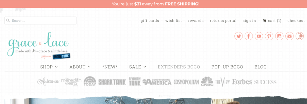
Banners can do everything from dynamic thresholds, showing visitors how much more they need to spend to unlock something like shipping to a countdown for purchase cutoffs for holiday guarantees. They’re a major player in low-profile website messaging that can be used to supplement other pop-ups or as a stand-alone.
Advanced Targeting Options for Pop-Ups
We’ve outlined the different types and placements for various pop-ups with some suggestions for targeting rules as well. However, it would be irresponsible of us not to go into targeting on its own, as advanced triggers are a key part of the evolution of pop-ups.
Long gone are the days of a spray-and-pray strategy, as we’ve covered. Instead, there are countless options for advanced targeting rules that can combine any one of these pop-ups with another to create a delightful experience.
- Open Upon Click: This can go one of two ways: triggering a pop-up to fire based on the visitor’s clicked element, whether that’s a website element like an add-to-cart button or the floating tab you set up to reopen a pop-up. This is a great option for very specific pop-ups designed to target certain behaviors or give visitors control over their pop-up experience.
- Time On Page Or % Scroll: These allow you to trigger a pop-up based on the time spent on a certain page or the percentage the visitor has scrolled. Both of these signal high intent, and a great use case is on blog pages. The longer they’ve spent, the more high-intent a visitor they are, and you can trigger a pop-up for lead capture or recommend related content. This is something we do on our own site to collect high-intent demo requests or recommend another piece of content based on their interests.
- Geo-Targeting: Based on where the visitor is located, you can display specific pop-ups like exit offers to direct them to nearby brick-and-mortar locations to avoid shipping delays, banners letting them know exactly when the cut-off is for holiday shipping, or if there are shipping restrictions like those for CBD or alcohol retailers. Justuno offers geo-targeting down to the zip code for pop-ups to get extremely granular with location-based messaging.
- Matching Element Exists: Target site-specific information like if they have logged in, loyalty program details, and more. This rule is limitless on Justuno; if it exists on your website, you can target it!
- Channel-Specific Opt-Ins: Know which of your visitors are subscribed to email vs. SMS or both to show the right lead capture or none at all. You can also collect additional channels like Instagram or TikTok handles, push notifications, etc.
- Cart Contents Down To Specific Product Variants: Target specific items in a cart, not just the cart total with your pop-ups. This is great for targeted product recommendations with complimentary items or those with high-abandonment rates on specific products for a pre-emptive exit strategy.
Final Thoughts
These are just a few of the advanced targeting rules you can apply to your pop-ups to create the personalized experience that visitors are looking for!
The strategies we’ve outlined in this blog can be applied to practically any industry and are meant to serve as a jumping-off point for how you build out onsite experiences. No matter the vertical, businesses using pop-ups should live by the mantra:
Right Visitor. Right Message. Right Time.
Today’s pop-ups enable just that through elevated design, advanced targeting, and in-depth strategy that puts the customer at the forefront of it all.
Try Justuno free for 14 days to unlock advanced targeting rules, granular audience insights, and pop-ups so personalized our customers see an average 135% lift in revenue during their first year!
