Regardless of what industry you’re in, it’s important to fill the top of the funnel with qualified leads for your sales team. One of the most effective ways to do that is to create an optimized website experience that collects prospects, pushes visitors closer to purchase, and in the long run, grows your business!
Let’s dive into twelve examples of B2B popups we’ve seen our customers use alongside a few we’ve used on the Justuno website itself!
1. Lead Capture + Content Download
This is a tried and true lead magnet strategy for B2B popups where you collect emails in exchange for industry news or educational content. Engage your customers with a popular question they are likely interested in, such as “How do you measure up to the competition” Then, provide an immediate incentive to download the whitepaper, ebook, etc. to get the answer in exchange for their email sign-ups.
This type of marketing qualified lead (MQL) is the perfect kick-off for a relationship since you provided clear value and established yourself as a thought leader in the space, making you a no-brainer to be top of mind for them when it comes to the solution you offer.
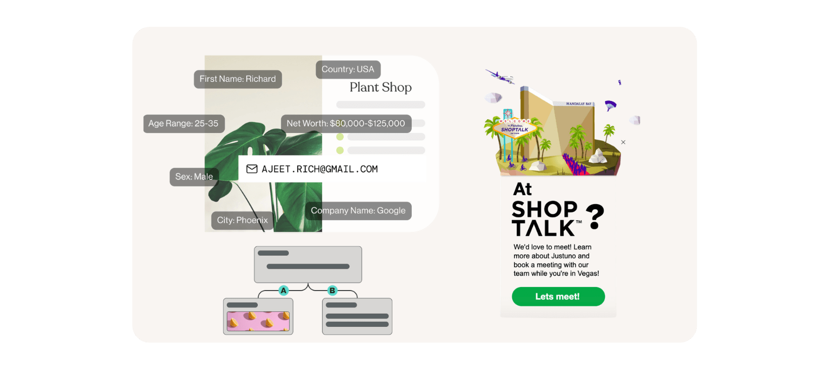
Pro Tip: With every email address you collect on a Justuno pop-up, we automatically enrich their profile with known data points for improved targeting. B2B customers see immense value in this feature as they can immediately have information about job titles, company revenue, etc. for improved prospecting.
2. Banner + Event Registration
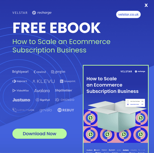
If you host webinars regularly (like most businesses nowadays), then you can advertise those on your website in banners. Double points for using something like a text ticker function to showcase multiple events with movement. Banners are great for site-wide messaging like this but don’t distract from the visitor’s purpose, making them a great invitation option.
3. Banner + Podcast Sponsorship
If one of your acquisition channels is appearing on podcasts or sponsoring episodes, you should make sure to have a promotion targeting visitors from it. Whether it’s a dedicated URL or simply a UTM campaign, you can set up a banner (or any b2b popup) to fire welcoming that traffic (use the podcast’s name!), reminding them of any offer you had, etc.
We used these for podcast sponsorships we’ve done in the past, they were great not only on that first visit, but we set up the banners to appear when a visitor whose first URL visited was that podcast’s landing page returned to the site and clicked through pages. This personalized their experience plus made it easy for them to redeem their 20% off offer.
4. Footer + Request Demo/Start Trial
For those of you who have a resources section on your site: blog, support, ebooks, webinars, etc. we recommend setting up a sticky banner for the bottom of those pages. Most organic search traffic will be coming to these sections of your site, making it critical that you have something compelling but not interruptive on those pages. Enter the sticky footer: it stays at the bottom of the visitor’s screen as they scroll your content, not covering anything up—ready for them to engage and sign up for something like a demo or request a quote. Your content marketing is doing the heavy lifting by piquing their initial interest, so ensure your onsite popups are ready to reap the rewards!
5. Event Invitation + Geo-Targeting
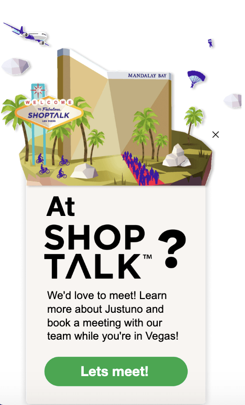
If you’re going to a conference, hosting an event, or even doing a pop-up shop/demo—you’ll want to drive foot traffic and potential customers to your location. Use geo-targeted pop-ups to let those in the area(s) know where to find you—choose from the country, state, or zip code to get as granular as you’d like.
We employed this strategy to invite our website visitors in the Las Vegas area to join us for a happy hour at a recent conference. Anyone who flew into town for the event and came to our website from marketing materials saw a pop-up inviting them to join us for drinks/meetings during the conference!
6. Exit Offer + Incentive
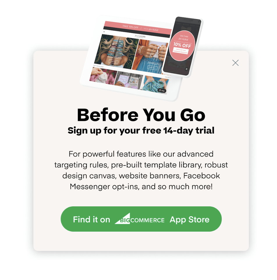
Exit offers are crucial for every business, but even more so for B2B because of a longer sales cycle. When making large purchases for their business, most stakeholders thoroughly research all options. That means the sales cycle is typically drawn out with repeated touchpoints and website visits. Make sure prospective customers see an exit offer when they leave your website, encouraging them to book a demo, request a quote, etc. You want to make sure you leave them with something to remember as they do their due diligence!
7. Flash Sales + Pop-Ups
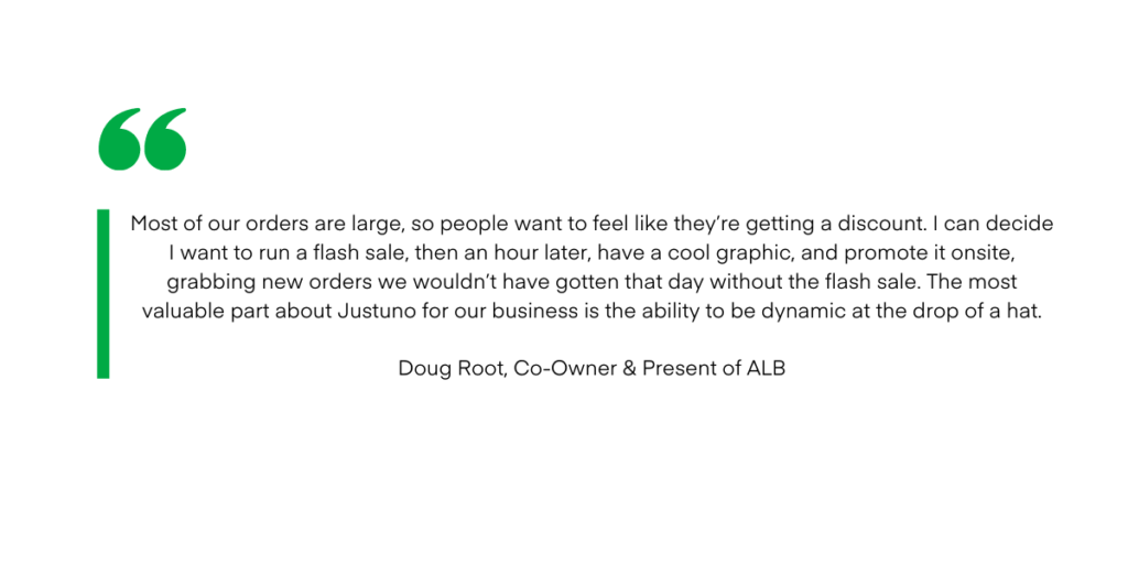
Flash sales are an effective method for some B2B retailers to close deals that have been in limbo for a while. Sometimes adding a timer to your promotions moves your prospects through the funnel because “I don’t have time to shop for this; this is a good deal, let’s do it.” One of our BigCommerce clients, Atlanta Light Bulbs, is a B2B electric outlet, and they implemented this exact strategy on their site:
8. Collect UGC
We all know that reviews and testimonials are the lifeblood of business (and retail), making it key that you collect them and use them on your website. If you have a UGC solution like Okendo, this process is super easy to display reviews on your website, but if you’re a SaaS company or other business that has multiple “listings” where you collect reviews—you’ll want to drive your customers to leave them on those profiles.
We implement this same strategy within our platform, where we ask our customers to leave a review for us after their first month on the e-commerce platform they came from. The pop-up takes them directly to the review submission portal to reduce friction and drive more engagement.
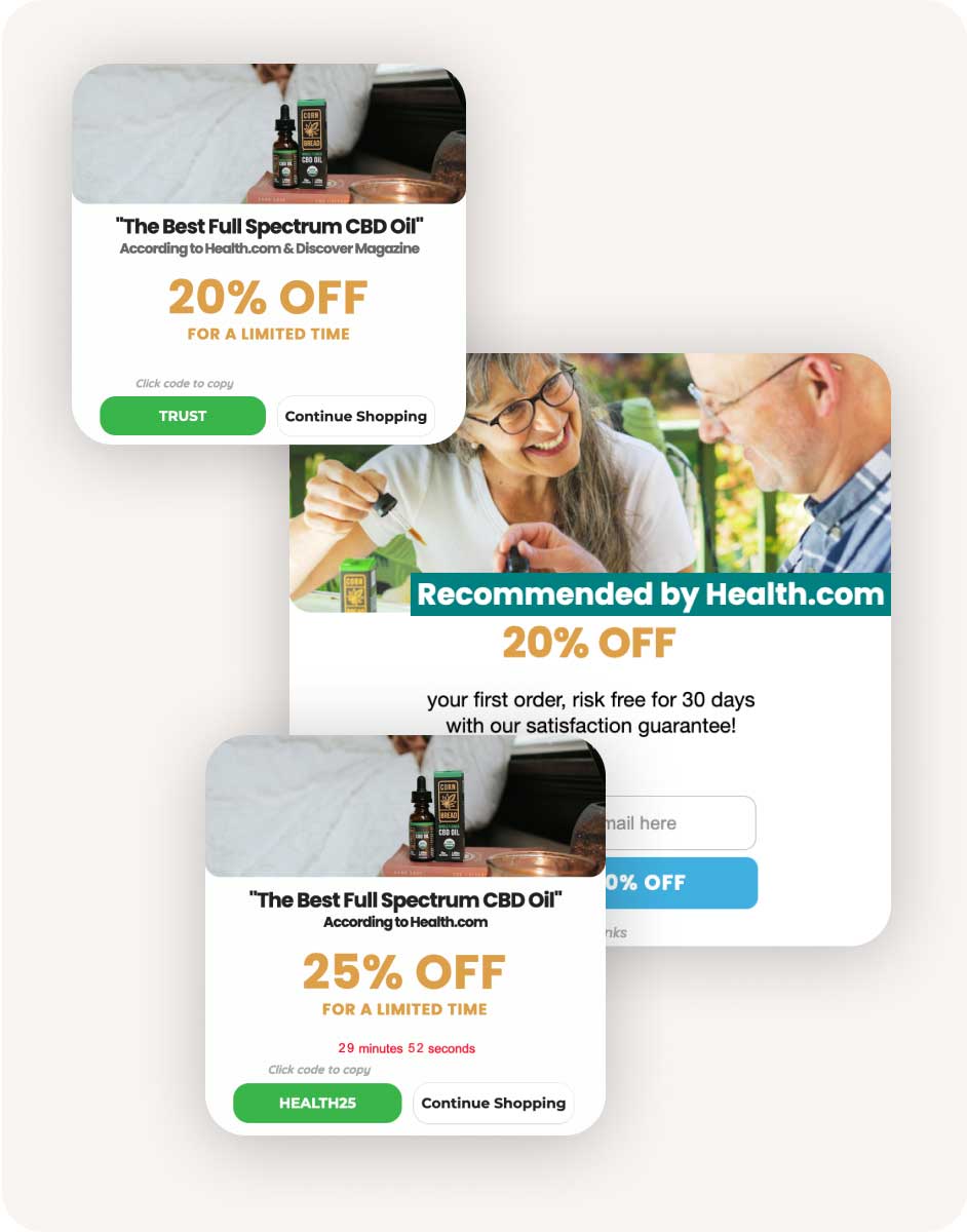
Alternatively, once you’ve collected these reviews, make sure you’re using them in your promotions—check out this example from one of our customers, Cornbread Hemp, who simply added a dynamic line of text to their pop-ups from a media-outlets review:
9. Support Hours + Banner
If you provide regular support or sales hours but need to alter those, make sure everyone knows! Use a banner to outline your availability, set expectations, and build trust/transparency with customers and prospects. Whether that’s for the holidays, unforeseen circumstances, or a company-wide Friday off—it’s a quick way to update your website & schedule it to turn off when your hours return to normal.

10. Landing Page
Create a lean landing page using Justuno’s full-page takeovers for all the flexibility you need without the headaches. You can use it for gating content, event sign-ups, etc. This example is from our agency partner, Tinuiti, who uses it to build a list of those looking for new marketing jobs.
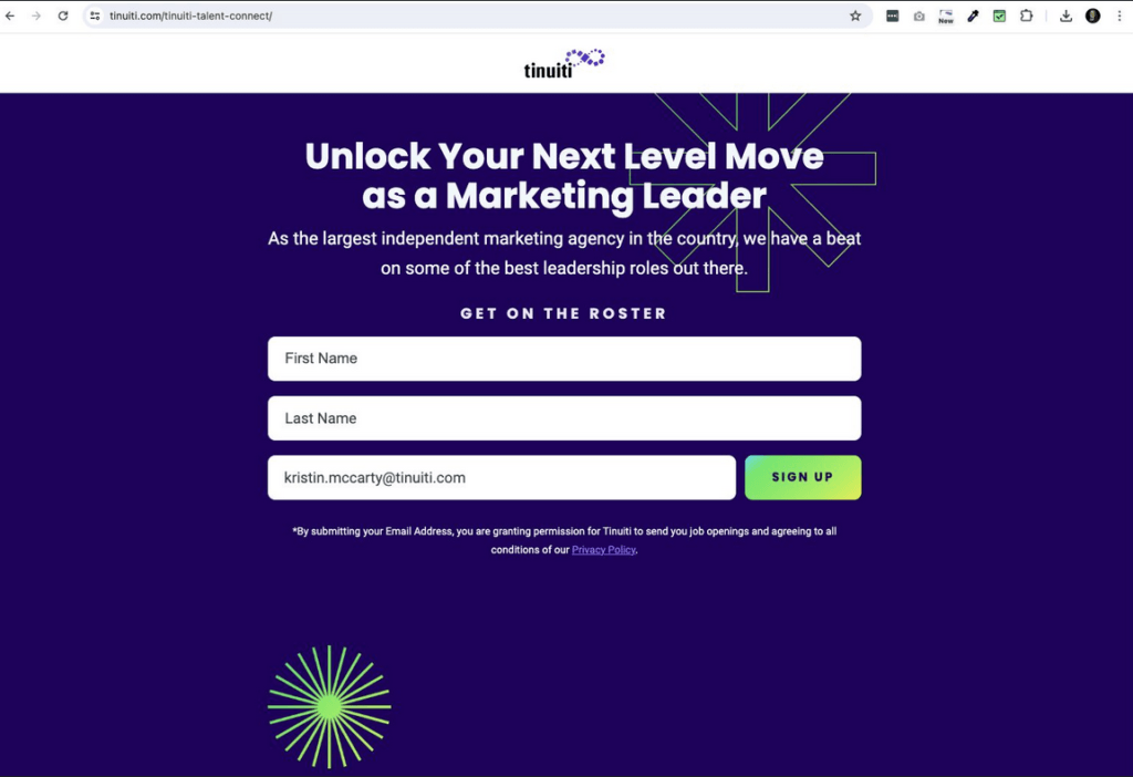
The flexibility of pop-ups is now available for landing pages, which is why more B2B brands are using Justuno’s landing pages for:
- Ease & flexibility to design a branded landing page for segmented traffic
- Ability to add landing page experiences to pop-up workflows
- Enable landing pages with targeted rules vs. URL rigidity
- Templates ready to use for speedy launch
- The option to use personalized AKA dynamic elements live on the page, like name, region name, influencer affiliation, etc!
11. Corner Badge / Flyout
If you recently won an award or made the shortlist for something in your industry, let your visitors know! A corner badge or flyout pop-up is a great way to add this accomplishment to your website and reinforce your expert status in your industry.
You could also use this b2b pop-up for other things like meeting links or offers!
12. Landing Page
Typically when you think of a “quiz” you think of a DTC brand looking to recommend products but a similar tactic can be implemented for B2B pop-ups with a little twist. We have a “pop-up style quiz” on the Justuno website that visitors can complete to receive personalized recommendations of pop-up templates to reach their business goals.
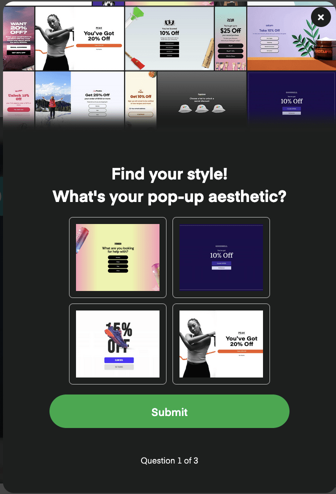
Another way to think of it is a quiz helps ensure high-intent leads are being funneled to your sales team while visitors are receiving a more personalized follow-up experience from you.
One of our customers, KegWorks, had a preference indicator pop-up on their website which is similar to a quiz. Since they cater to both businesses and end-users alike, KegWorks wanted to start segmenting new subscribers into separate buckets for B2B vs. DTC content. Then, they wanted to break those segments down further by the product categories the subscriber is interested in for more relevant HubSpot campaigns powered by zero-party data.
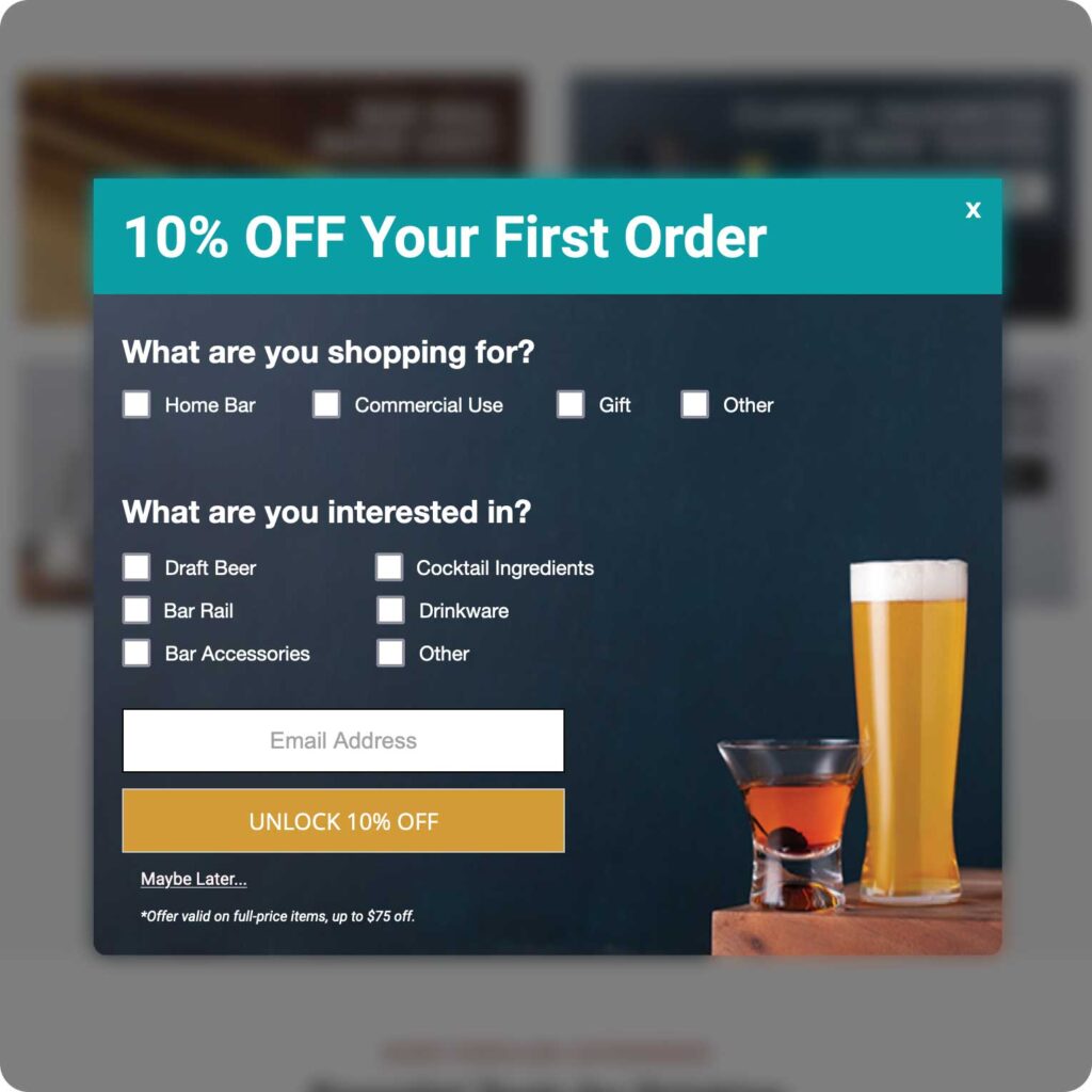
These are just a few examples of how B2B pop-ups can help businesses collect more leads, drive more sales, and optimize the onsite experience for their customers.
Ready to get to work? Try out Justuno for 14 days to uncover hidden opportunities for your business!
